CSS box model
The box model is the heartbeat of CSS layout. Every element on a page is a box made up of layers: content, padding, border, and margin. Once you internalize how these layers stack and how widths are calculated, layout bugs turn into predictable math rather than mystery.
Box model layers and what they do
- Content: The actual text, images, or child elements. Controlled by properties like
width,height, andline-height. - Padding: Space between the content and the border. It expands the visual/clickable area and inherits the element’s background.
- Border: The line around the padding and content. Controlled by
border-width,border-style, andborder-color. - Margin: Space outside the border. It’s transparent and creates separation between elements. Margins can collapse vertically between block elements.
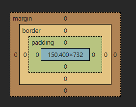
Tip: In DevTools, you’ll see content (light blue), padding (green), border (yellow), and margin (orange). Right-click an element → Inspect → Layout/Computed panel to view the box model.
How width and height are calculated by default
By default, CSS uses box-sizing: content-box. That means width and height apply only to the content area. Padding and border are added outside of that value, increasing the final rendered size.
- Default total width (content-box):
total width=content width+padding left+padding right+border left+border right
- Default total height (content-box):
total height=content height+padding top+padding bottom+border top+border bottom
- Margin adds outside the element and doesn’t affect the element’s own total width/height it affects spacing relative to other elements.
Example: content-box calculations
Code Block Loading...
Changing the model with box-sizing
box-sizing lets you choose whether width and height include padding and border.
- content-box (default):
width/heightapply to content only. - border-box:
width/heightinclude content + padding + border. The declared size equals the final rendered size. - Total width/height with border-box:
declared width=content+padding+borderdeclared height=content+padding+border
Example: border-box makes layout sizing easier
Code Block Loading...
Tip: Many projects set * { box-sizing: border-box; } to make layout math predictable.Devtools visualization and margin collapse notes
- DevTools panels: Firefox shows the box model under the Layout panel; Chrome shows it under the Computed tab. You can hover values to see overlays on the page and test different paddings, borders, and margins live.
- Margin collapse: Vertical margins between block elements can collapse into a single margin. For example, a parent with no padding/border and a first child with
margin-topwill often push the parent down. Addpadding,border, oroverflow: autoon the parent to avoid collapsing where needed.
Interactive playground: experiment with content, padding, border, margin, and box-sizing
Use the controls to change width, height, padding, border, margin, and box-sizing. The computed totals update in real time and the visualization helps cement the model.
Key takeaways and best practices
- Prefer border-box for layout sanity: Declared width equals final width, which simplifies responsive grids and cards.
- Remember margins don’t affect the element’s own size: They affect spacing around it. Margin collapse happens vertically in specific scenarios.
- Use DevTools actively: Inspect elements to see the box model and test changes live. It’s the fastest way to debug spacing issues.
- Make spacing predictable: Use logical properties (like
padding-inline,margin-block) for writing-mode-aware layouts, and keep a consistent spacing scale.